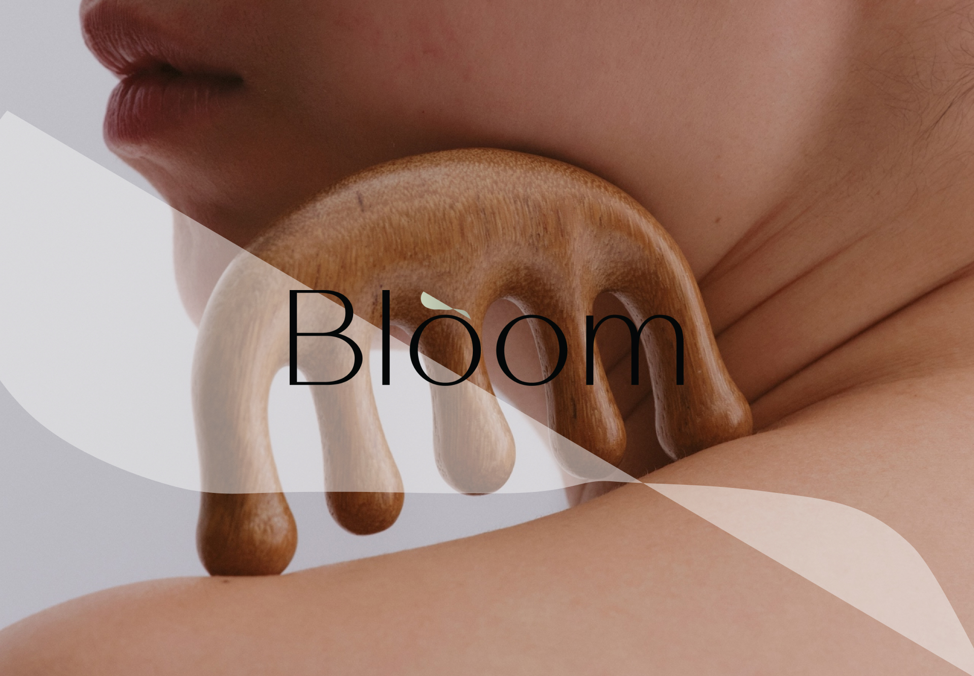
Bloom identity
The project focused on enhancing the user’s experience through a harmonious and visually refined interface. Inspired by traditional Japanese aesthetics, the branding embraced simplicity, balance, and elegance.
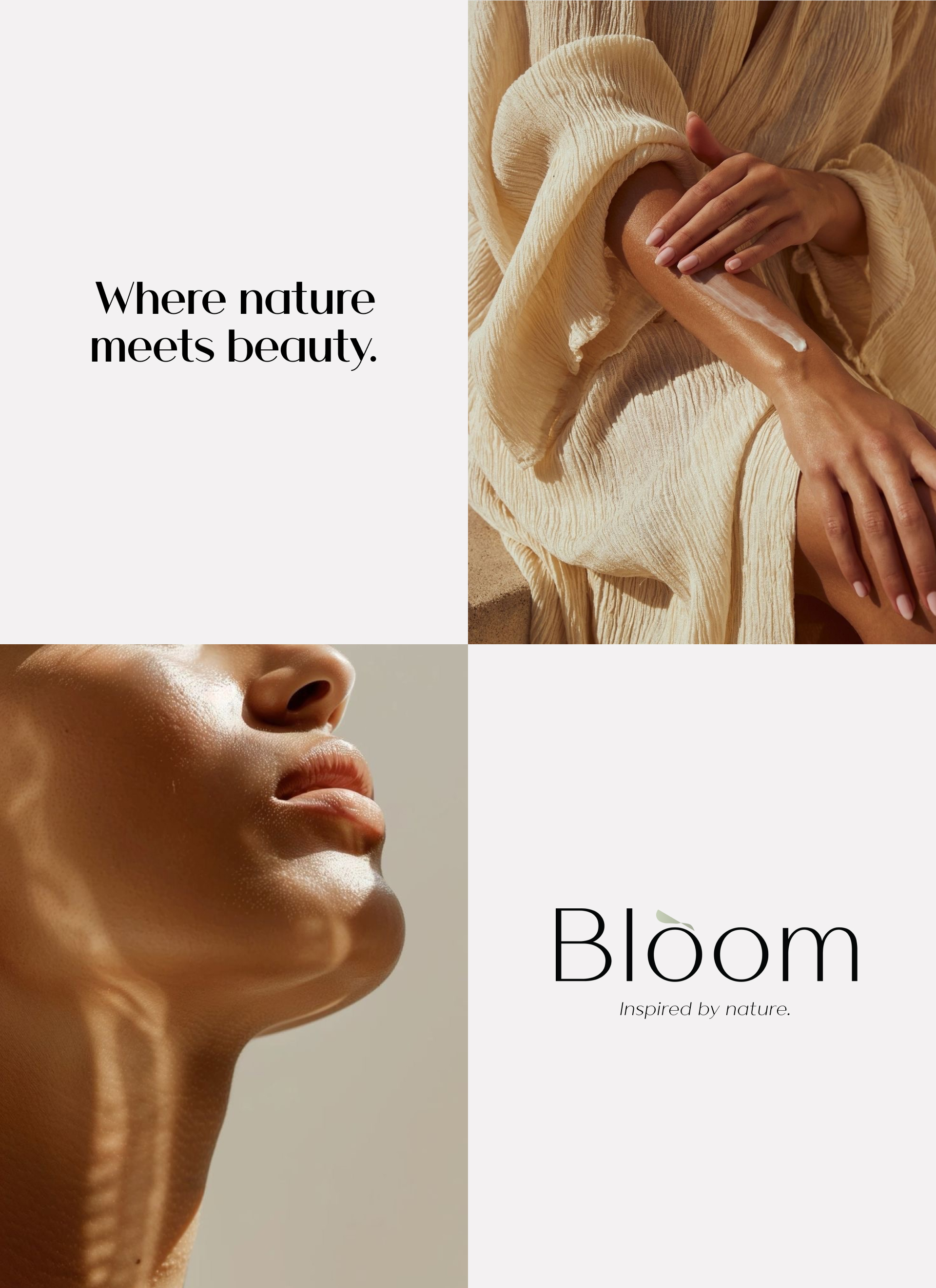
A color palette drawn from nature—soft beige, gentle white, and light olive green—evoked a sense of calm, purity, and grounded beauty. These tones, paired with clean typography and organic textures, created a serene visual identity that honors tradition while appealing to the modern sensibility.
The result is a brand presence that feels timeless, inviting, and authentically rooted in the philosophy of understated beauty.
our role in the project
ux — branding
USED TOOLS
figma — photoshop